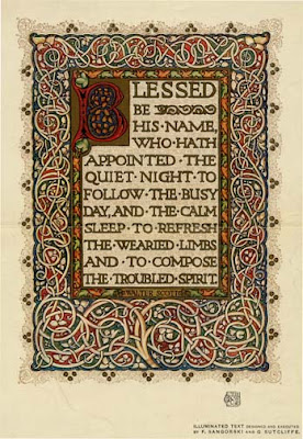


these are the three images that are similar or kind of the same. I think these images are interesting because I like the old look of the mid evil idea, also shows creativity in the artwork. in a normal story book the books their would be a page with writing and a picture talking about the story. I think the illuminated text shows a story inside and around the letter that explains the story if you can't understand the language like the Monks language.
I like the design that's been put into these letters because each starting letter has allot going on like the amazing detail, it has something like vines growing around the starting letter and around the page that makes a border.
Back in the mid evil days illuminated text was printed by hand, and it also had taken hours to complet just one illuminated text. Also in the mid evil days books were made with the illuminated text as well, but these book were made for the wealthy people because the wealthy could read an they can afford to read. To make the illuminated text worth more, they could ad gold to the text. If I was to create a illuminated text, I would draw a parchment font letter then ad Maori patterns inside and around the letter.

Hi james
ReplyDeletethis is your strongest blog entry, I suspect because it is something you found interesting. You have provided a good range of examples, each quite different to the others. You also make a good observation that even if you couldn't read the words you could still gain information from the decoration on the page. Good to see this piece of research has begun to appear in your studio work. Grant